Mastercard
- UX/UI Design
- Visual Design

Overview
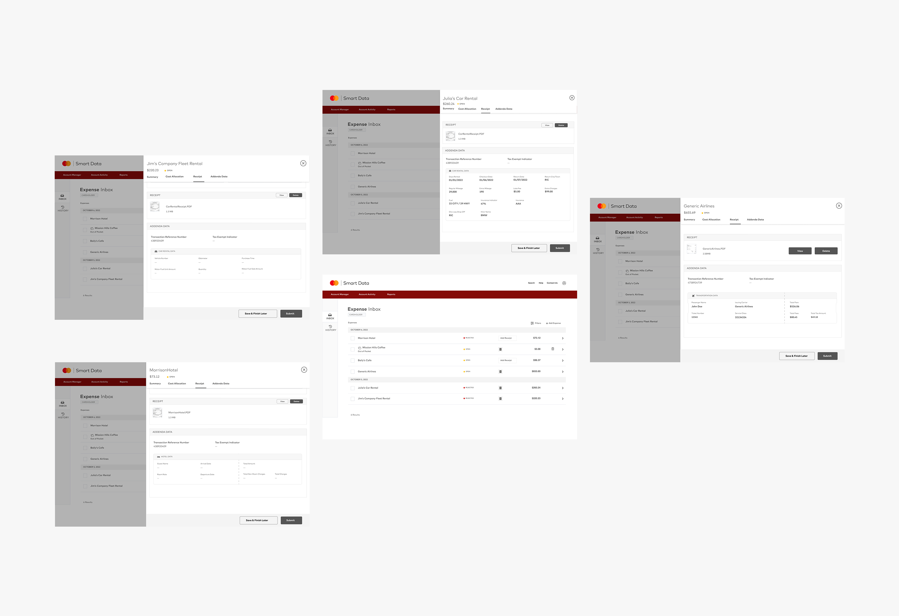
Businesses are seeking enhancements in the management of their financial records and the reconciliation process for their card program expenses. To address this objective, corporations are looking to leverage Addenda Data linked to merchant expenses. The key challenge is centered around the requirement for the Expense Management (EM) system to incorporate and present this specific data seamlessly within the user interface (UI). The ultimate goal is to facilitate easy and efficient access to Addenda Data, enabling corporates to streamline their recordkeeping and reconciliation efforts effectively.
Problem Statement
The challenges included creating an intuitive and user-friendly interface, improving navigation and information hierarchy, ensuring a cohesive and visually engaging design, and optimizing the overall user experience.
The goal was to provide visitors with a seamless browsing experience and instill confidence in the web app Addenda Data.

My Role
Create an end-to-end web application with a viable business model, strong value proposition
By applying user-centered design principles, I crafted a new web app design that emphasizes clarity, simplicity, and visual appeal. I focused on enhancing information architecture, streamlining navigation, and creating engaging visual elements.
Persona

User Journey

User Level

Style Guide

Interactive Prototypes
Design

Tags
User research / User persona / Wireframes / User interface / Design system / Prototyping / Usability testing

